- Mobile UX · Co-living
- Zolo Design Challenge
- 2022
Events at Zolo
Adding a community layer to the Zolostays co-living app, in a design language I had to rebuild from screenshots.
- Client
- Zolostays, design challenge
- My role
- UX and UI design, end to end
- Platform
- Mobile app, iOS and Android
- Output
- 13 screens, each in light and dark mode
01
The brief
Zolostays asked for a new feature, Events, built as an extension of the existing app and integrated so seamlessly that residents wouldn’t notice where the old app stopped and the new feature began.
There was a catch. No design system, style guide or source files came with the brief. The only reference for the app’s visual language was the live product itself.
So the challenge was really two problems stacked on top of each other: first reconstruct the system, then design a new feature inside it without breaking it.
02
Who Events is for
Events has two audiences with different needs. Residents want an easy way to find things happening in their building and meet the people they live with. Zolo wants a channel to run and promote its own programming at each property, from carrom tournaments to poetry nights.
The design has to serve both without either feeling like an afterthought: social and low-pressure for residents, structured and measurable for Zolo.
Illustrative personas, written for this case study to frame the problem
Aditi, 24
Resident, three months into a new city
Moved to Bengaluru for her first job. Knows her roommate and the security guard by name, and not many others.
Wants to join something without having to make the first move, and to know what she’s signing up for before she commits.
Rahul, 31
Community manager for several Zolo properties
Organises events across properties using WhatsApp groups and notice-board posters, and has no reliable way to know who’s coming.
Wants headcounts before the day, a place to post rules and results, and a way to bring people back for the next one.
03
Rebuilding the design language
With nothing but the live app to go on, I audited its screens and pulled out the decisions behind them: the brand blue and coral, Poppins as the typeface, how list rows were spaced, how icons sat against text, and how actions were styled.
Everything in Events was then built from that reconstructed set, so new screens would inherit the app’s rhythm instead of approximating it.
Values below are measured from the final Figma frames. Type sizes are read from text-box heights, so treat them as close approximations.
The app’s palette, not this site’s
Zolo blue
#00AEEF
Status bar, list headers, property name
Coral
#E8455F
Actions, active tab, key values
Secondary grey
#7C7C7C
Supporting text
Hairline
#D9D9D9
Row dividers
Surface light
#FFFFFF
Light mode
Surface dark
#121212
Dark mode
Type, Poppins throughout
- 18 medium
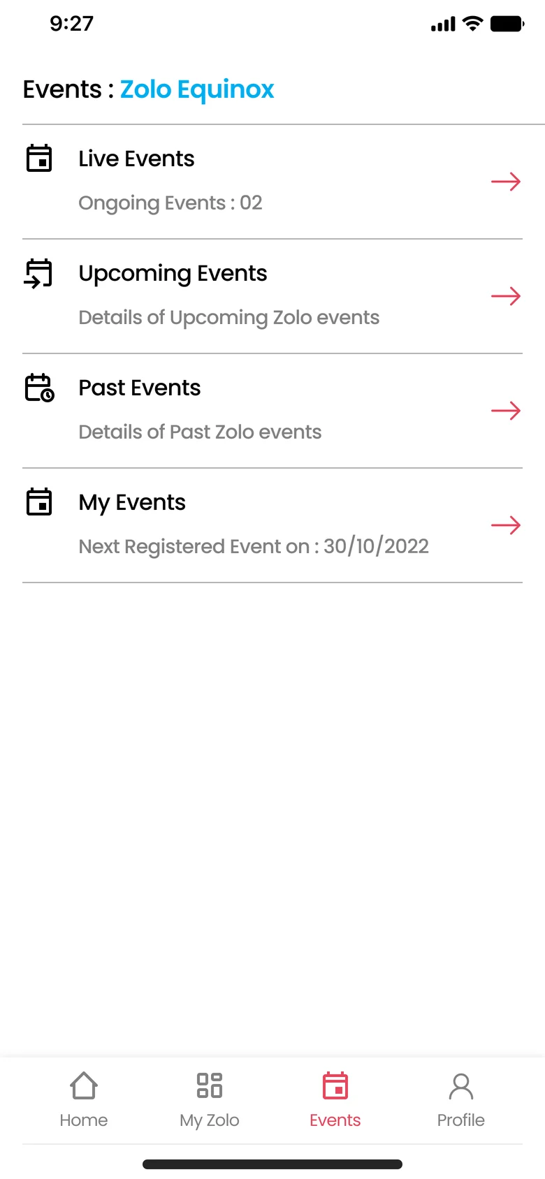
- Events : Zolo Equinox
- 16 medium
- Upcoming Events
- 14 regular
- Details of upcoming Zolo events
- 12 regular
- Home My Zolo Events Profile
Spacing and structure
| Measure | Where it’s used | Value |
|---|---|---|
| Screen margin | Every screen, edge to content | 16 |
| Icon size | Row and navigation icons | 24 |
| Text indent | Margin + icon + gap | 56 |
| Row pitch | All list screens | 82 |
| Action pill | Notify Me, RSVP, Explore Zolo | 32 high |
| Event hero | Image, with sheet overlapping by 26 | 240 |
04
Structure
Events takes a slot in the bottom navigation alongside Home, My Zolo and Profile, so it reads as part of the app rather than a feature bolted onto it. The hub splits events by time, which is how residents actually ask about them: what’s on now, what’s coming up, what happened, and what am I signed up for.
People who aren’t yet Zolo residents hit a gate instead of an empty screen, which points them towards finding a property.
05
Wireframes
The low-fidelity pass settled the layout before any styling: the same 82px row for every list, so the hub and the four lists share one pattern, and an event page built as an image with a sheet sliding over it, so each event has one consistent anatomy.
These wireframes are generated from the same structure as the final screens, with content reduced to blocks.
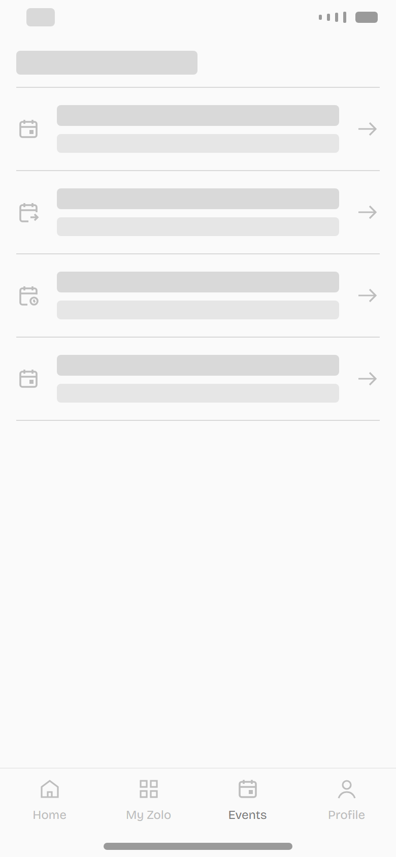
HubFour entry points split by time, one repeated row 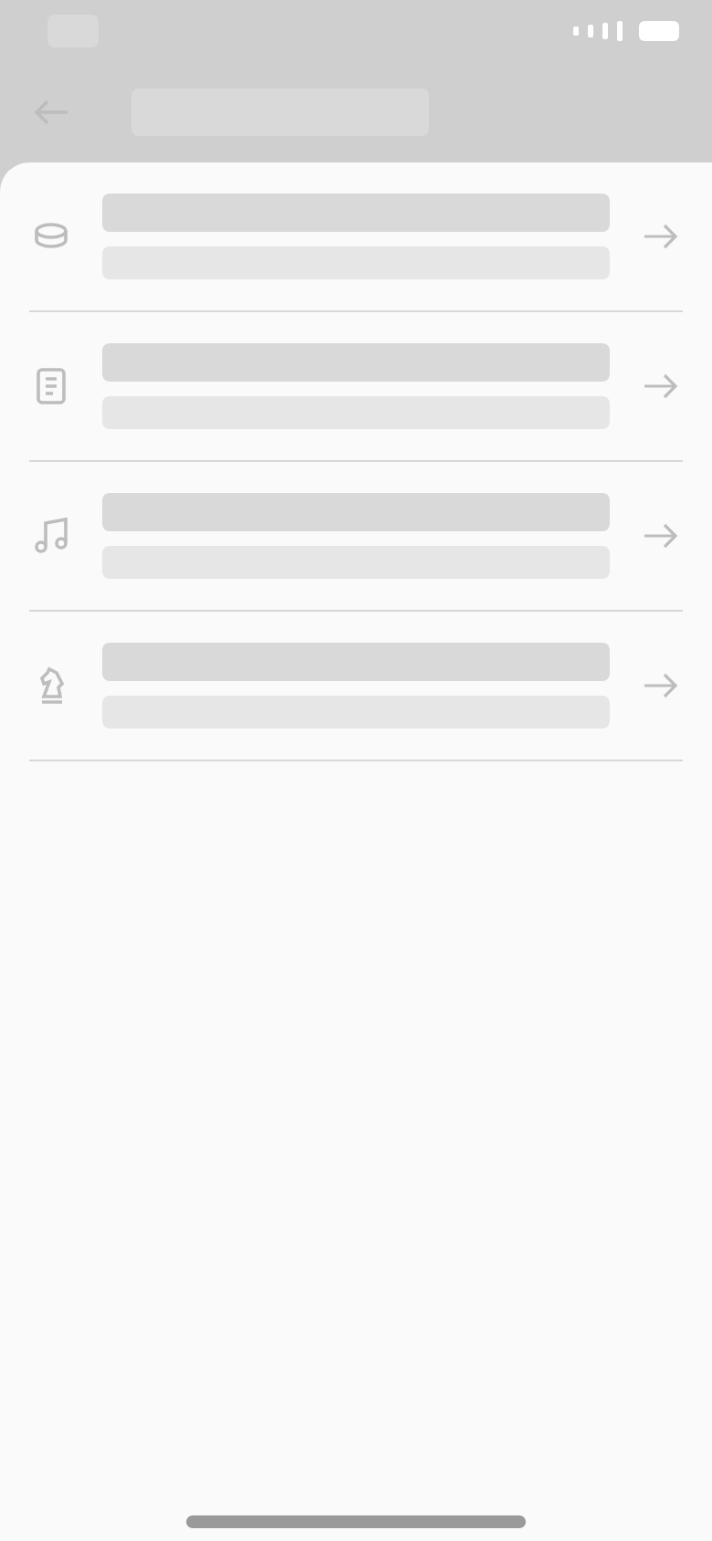
ListSame row as the hub; only the secondary line changes 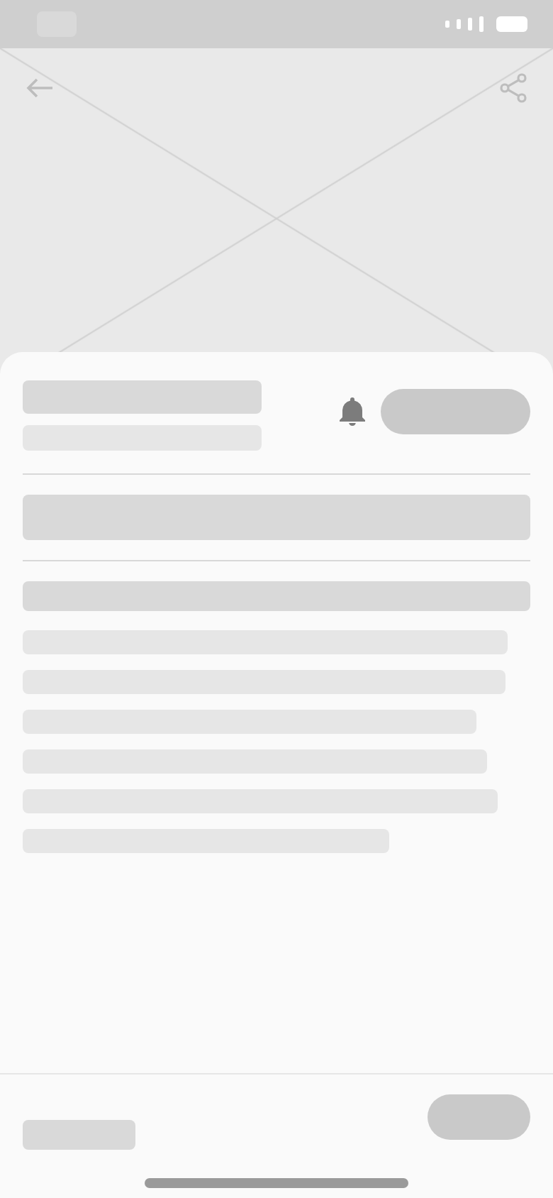
Event pageImage, then a sheet: title and actions, details, then a fixed footer 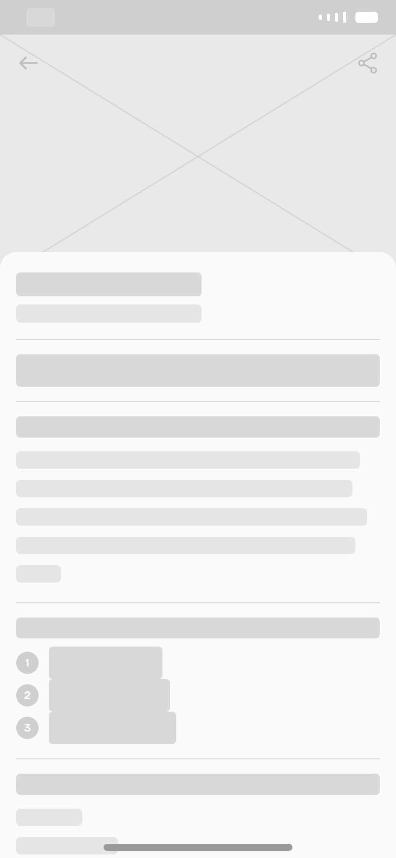
Past eventSame anatomy, with results replacing the actions
06
One page, five states
The most important decision was to design the event page as a single template that changes with the event’s lifecycle, rather than a set of different pages. A resident always lands in the same place; what changes is what the page offers them at that moment.
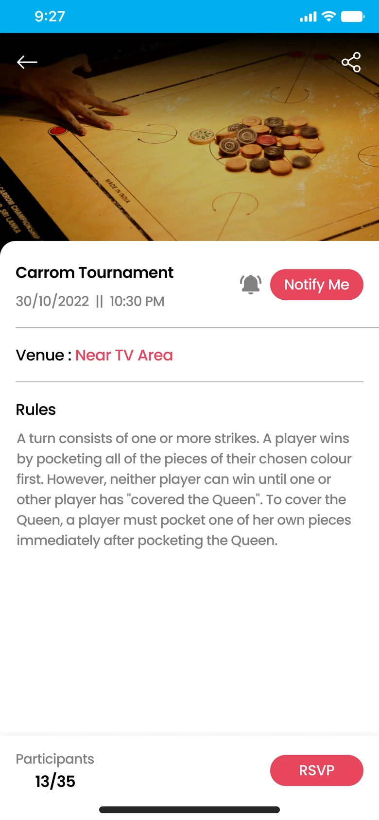
What changed: Both actions visible. Capacity shown as 13/35.
07
Key decisions
Separating “Notify Me” from “RSVP”
Not everyone is ready to commit weeks ahead. Notify Me sits next to the event title as a low-stakes way to stay interested, while RSVP sits in the footer as the real commitment. Once someone RSVPs, the buttons give way to quiet confirmations: a coral bell and a thumbs-up.
Showing capacity, not just attendance
Participant counts are shown against the limit, like 13/35. This tells Zolo how close an event is to full, and gives residents a gentle nudge when spots are running out.
Giving events an ending
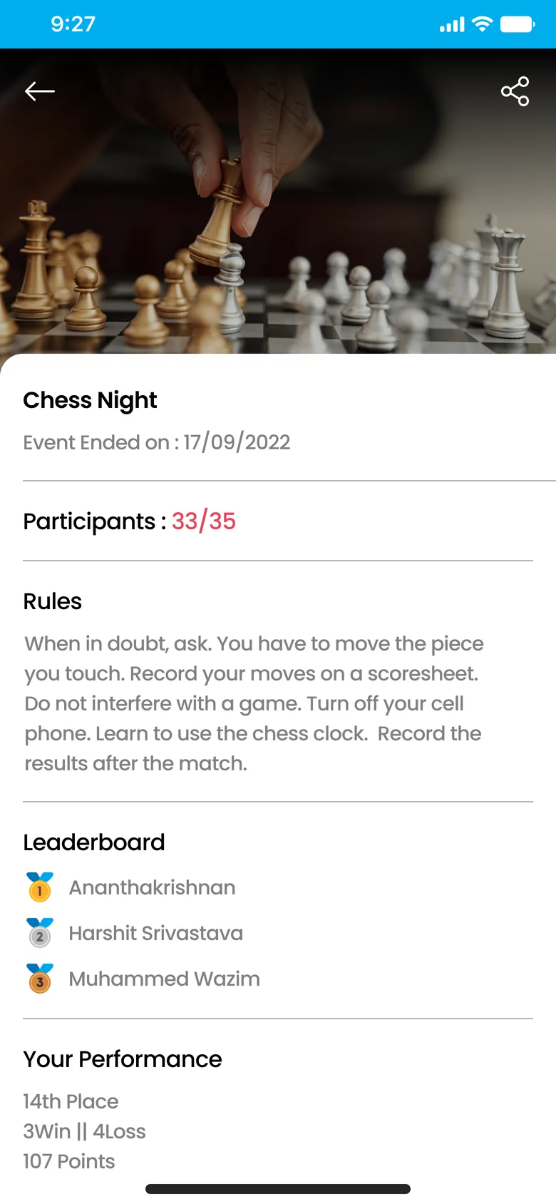
Past events don’t just disappear. They show the leaderboard and, for people who took part, their own result. That closure is what makes someone want to come back for the next one.
Turning a dead end into a path
Non-residents can see the Events tab, but instead of an empty or broken screen they get a clear explanation and an Explore Zolo button. A potential dead end becomes a reason to look for a property.
Reusing the list row everywhere
The hub, all four lists and the event metadata use one row pattern drawn from the existing app. Fewer new patterns meant less for residents to learn and less for developers to build.
Dark mode from the start
Every screen was designed in both light and dark mode, so Events matches whichever theme a resident already uses, with no jarring switch when they open the tab.
08
Final screens
Thirteen screens, each delivered in light and dark mode.
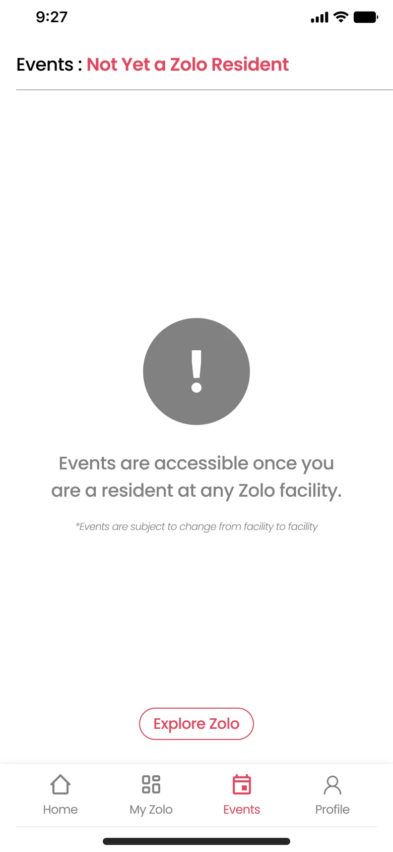
Not yet a resident Events hub 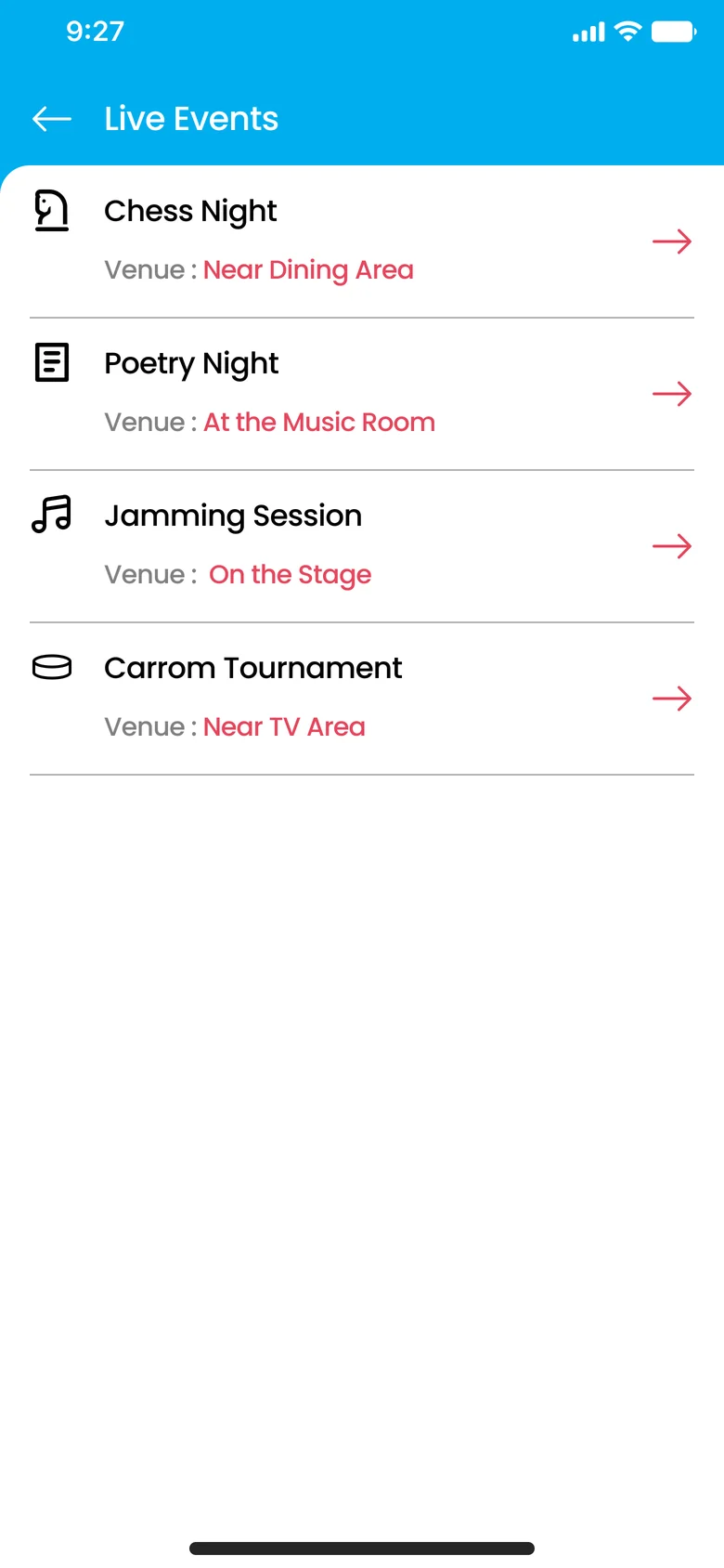
Live events 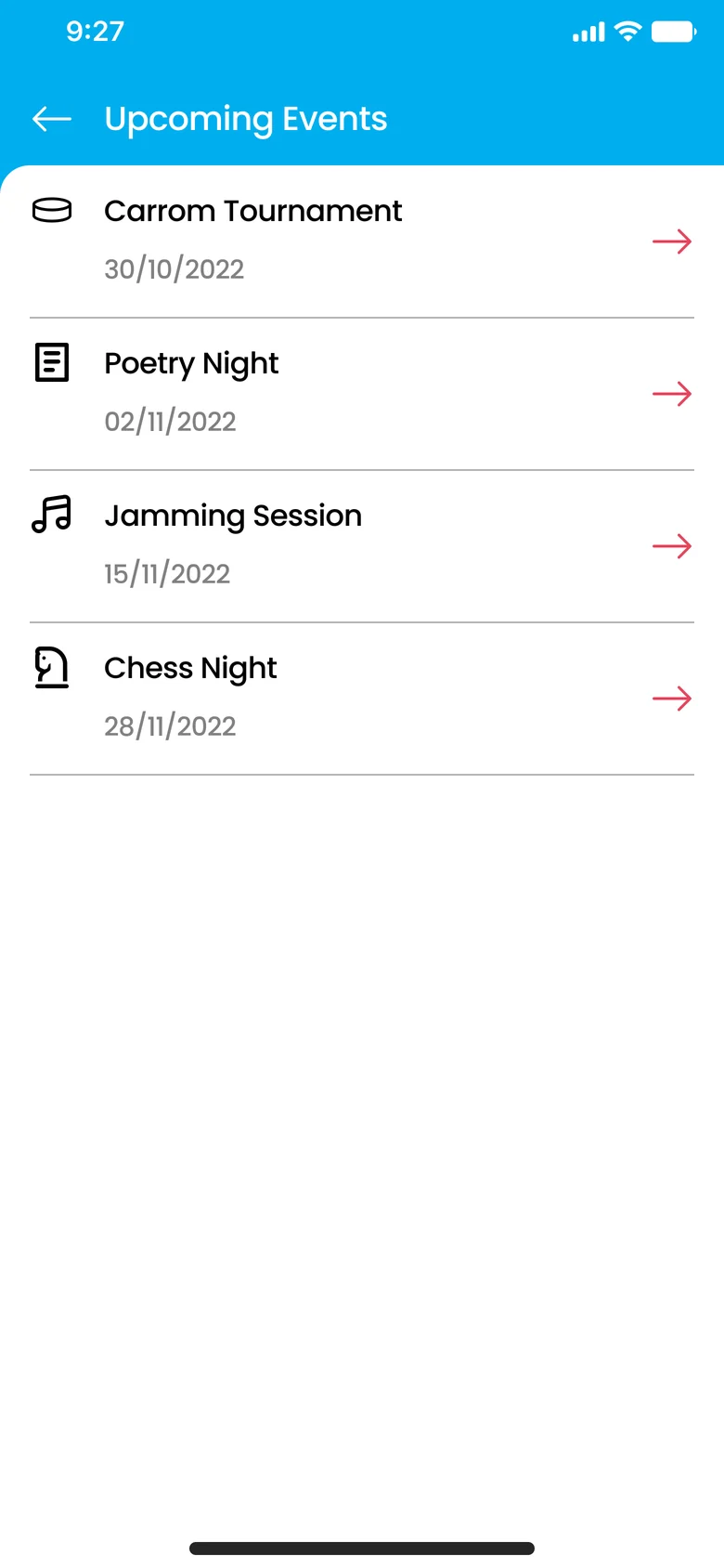
Upcoming events 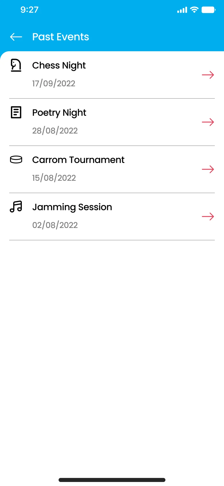
Past events 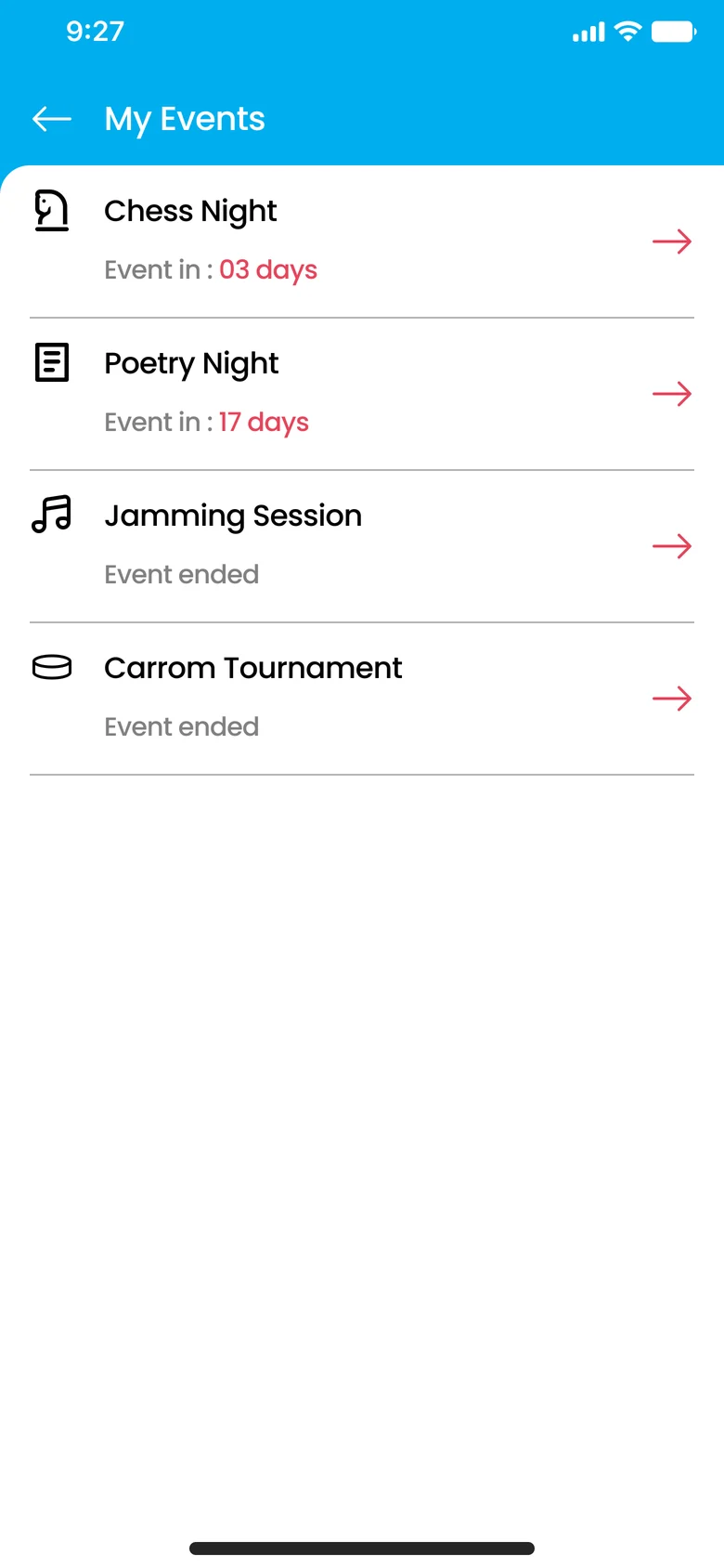
My events Upcoming event 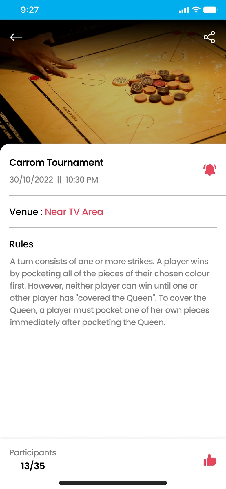
After RSVP 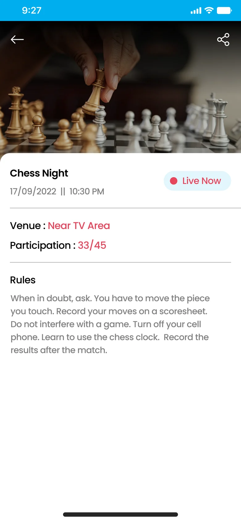
Live event 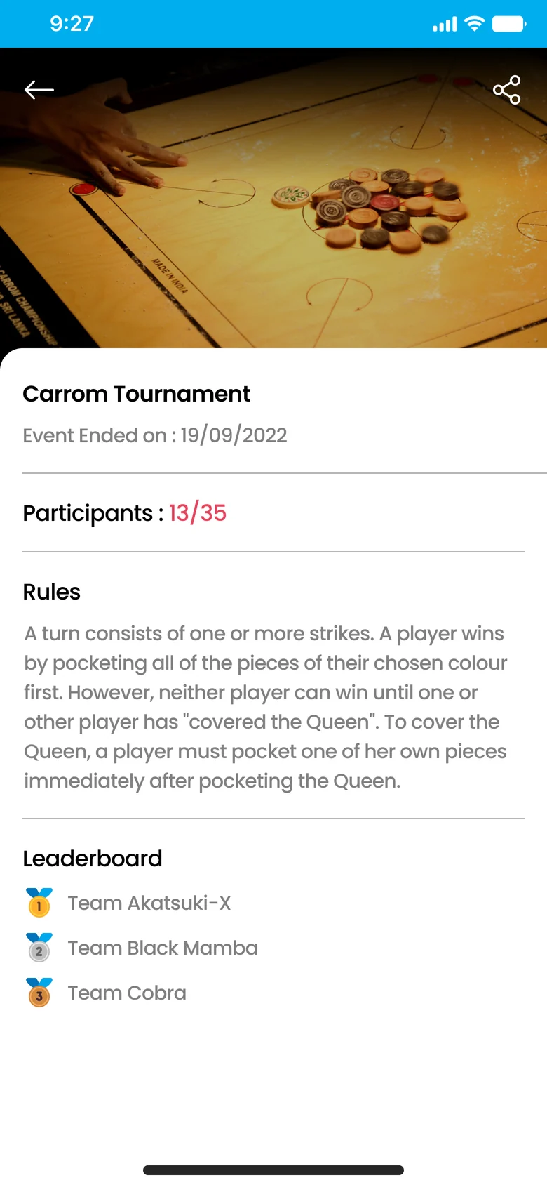
Past event 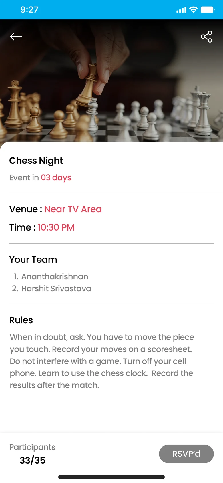
My event, upcoming 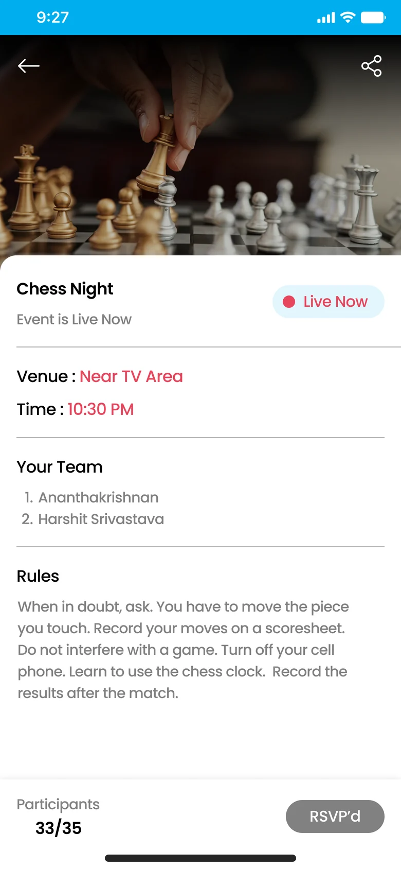
My event, live My event, ended
09
How I’d measure it
The challenge ended at design, so there’s no launch data. These are the signals I’d track to tell whether Events is doing its job for both residents and Zolo.
Hypothetical targets for illustration, not real results
| Signal | Target | Why it matters |
|---|---|---|
| Residents who open Events in their first month | 60% | Is the tab discoverable and worth a tap? |
| RSVPs that turn into attendance | 75% | Is RSVP a real commitment, or just a click? |
| Notify Me taps that later become an RSVP | 30% | Does the low-stakes option actually lead somewhere? |
| Attendees who come to a second event within 60 days | 40% | Is the community part working? |
| Gate screen taps on Explore Zolo | 15% | Is the non-resident screen earning its place? |
10
Looking back
The most valuable part of this challenge turned out to be the part that wasn’t asked for. Reverse-engineering the app’s design language forced me to understand why its screens looked the way they did, and that made extending it feel natural rather than imitative.
What I’d do next
Let residents host their own events. The current design covers Zolo-run programming well, but the strongest communities come from residents organising things themselves, like a weekend football match or a cooking night.
Add calendar export and check-in. A one-tap add to calendar would help RSVPs turn into attendance, and a simple check-in at the venue would give Zolo accurate headcounts.
Revisit contrast. The light grey secondary text and coral on white, both inherited from the existing app, are likely to fall short of WCAG AA for small text. That’s worth raising with the Zolo team, since fixing it properly means changing the core palette rather than just Events.
Events at Zolo, a design challenge for Zolostays. Personas and metrics on this page are illustrative.