- Mobile UX · Fintech
- Kotak Design Challenge
- 2023
 Kotak design challenge · 2023
Tag Mate.
One place to see, top up and buy every FASTag in the family, whichever bank issued it.
- Brief
- UI/UX design intern challenge, Kotak Mahindra Bank
- Role
- UI/UX designer
- Year
- 2023
- Platform
- Mobile app
- Tools
- Figma
- Output
- 8 screens, plus 4 error states
01 — The brief
A new product, not a new feature
FASTag is the RFID sticker that pays tolls on Indian highways, and every vehicle now needs one. Tag-Mate is a standalone app for managing those tags and buying new ones.
The challenge started from nothing. There was no existing app to extend and no design system to follow, so the name, the logo, the visual language and the structure of the product all had to be made before a single screen could be designed.
02 — The problem
One household, several tags, several banks
A FASTag is issued by a bank and lives inside that bank's app. A family with two cars and a bike can easily hold three tags from three issuers. Checking whether there is enough balance before a trip means opening three apps, and buying a tag for a new vehicle means picking a bank first.
Today one app per issuer
Three logins, three layouts, no total view.
Tag-Mate one app for all tags
- See every balance
- Top up any tag
- Review tolls
- Add a tag
- Buy a new tag
03 — Identity
Naming it and giving it a face
The name says what the app is for: a companion for your tags. The mark is a simple cat head built from a few straight cuts, so it stays crisp at icon size and works as a single flat shape in white or blue.
The mark then does real work across the product. It opens the app on the splash screen, sits above the sign-in field, and anchors the header of every main screen next to the screen title. The error screens carry a cat too, so even a failure feels like part of the same product.
04 — Information architecture
As few screens as the job needs
I wanted the app to be very simple but functionally complete, so I mapped the minimum set of screens that covers what a driver actually does: get in, see their tags, check tolls, top up, and add or buy a tag. Everything after sign-in hangs off one home screen.
- Getting in
- Home
- Tab destinations
- Content and forms
The map shows a password-based sign-up. In the final screens, sign-up and sign-in became one passwordless route: enter a mobile number, confirm a one-time code, or skip both with Google or Truecaller.
05 — Style sheet
A small system, built first
With no design system to inherit, I set one up before designing the screens: a blue primary palette, one type family, and a handful of components. New screens were built only from these parts, which keeps eight screens feeling like one product.
The app’s palette, not this site’s
Colour
#0063CCPrimary blue. Headers, buttons, active tab#FFFFFFScreen background, button text#000000Body text and inactive icons#002853Status bar and deep navy surfaces#014088Shade on the active tab button#747474Disabled states and secondary text
Type Gilroy
| Bold | Wordmark, screen titles, balances, buttons |
| Semibold | Vehicle names, section prompts |
| Medium | Field labels, list rows, supporting text |
Components





06 — Wireframes to final
Structure first, colour last
Each screen started as a grey layout of boxes and lines, so the order of content could be settled before any styling. Pick a screen to compare its wireframe with the final design.
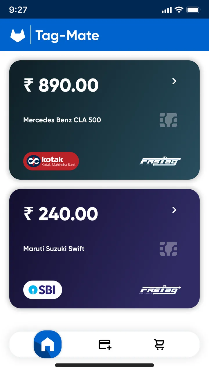
Home
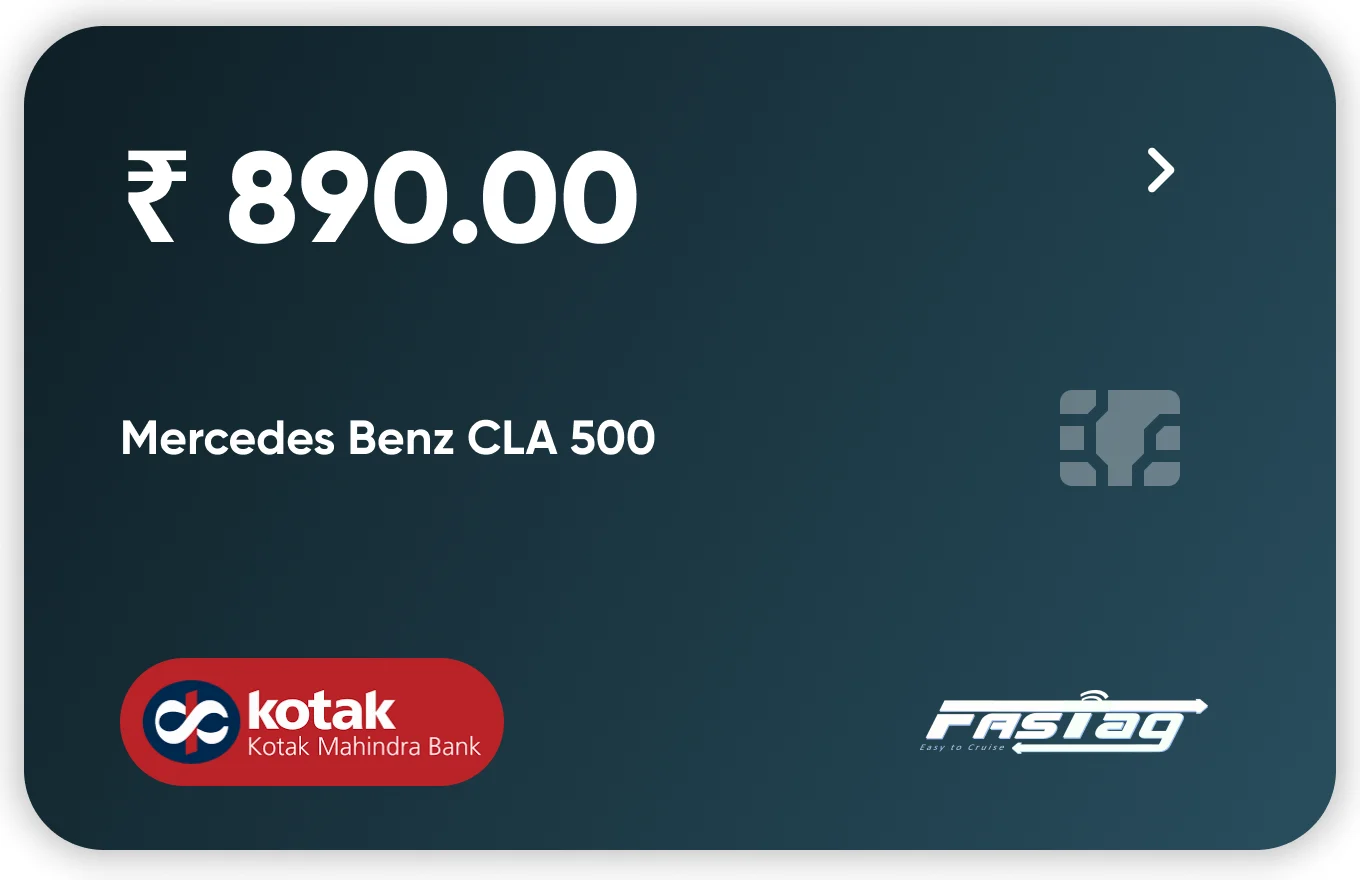
Each tag is a card with the balance first, then the vehicle, then the issuing bank. The chevron signals that the card opens.
07 — Flows
Four jobs, each a tap from home
Once you are signed in, every core task starts from the home screen or the tab bar and takes one or two screens to finish.
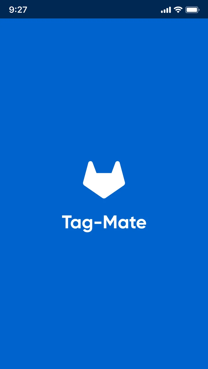
1. Open the appThe mark and name while it loads.
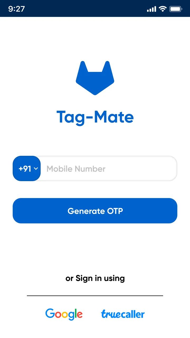
2. Enter a mobile numberOr skip with Google or Truecaller.
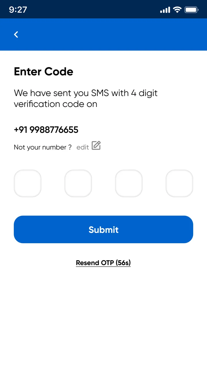
3. Confirm the codeFour digits, with edit and resend.
4. Land on homeAll tags, balance first.
08 — Key decisions
What shaped the screens
Every tag is a card
Each FASTag looks like a payment card, with its own colour, the issuing bank's badge and the FASTag logo. People already know how to read a card, and the colour makes a car easy to spot in a stack.
Balance comes first
The rupee balance is the largest thing on the card, above the vehicle name. The question a driver opens the app with is whether there is enough money for the trip.
Three tabs for three jobs
Home, add a tag and buy a tag are the whole app. A floating tab bar keeps them one tap away, and the active tab lifts into a blue button so you always know where you are.
Phone number in, password out
Sign-in needs only a mobile number and a four-digit code, with Google and Truecaller as one-tap shortcuts. A wrong number can be fixed from the code screen without starting over.
One form pattern for adding and buying
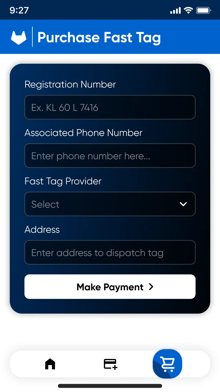
Add and buy share the same card-style form. Buying asks for the same two fields plus a provider and a delivery address, so the second form feels familiar after the first.
History reads like a statement
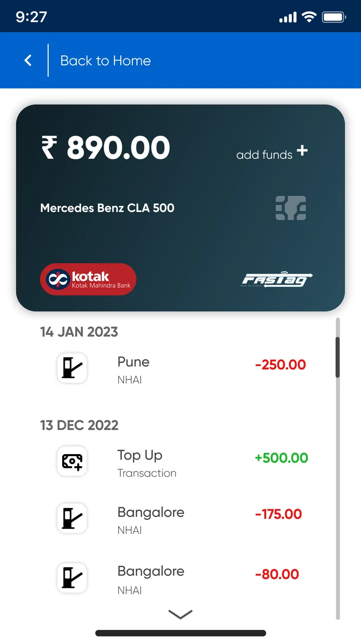
Tolls and top-ups are grouped by date, tolls show the plaza city and the operator (NHAI), and amounts are signed and coloured: red for money out, green for money in.
09 — Edge cases
When the network drops
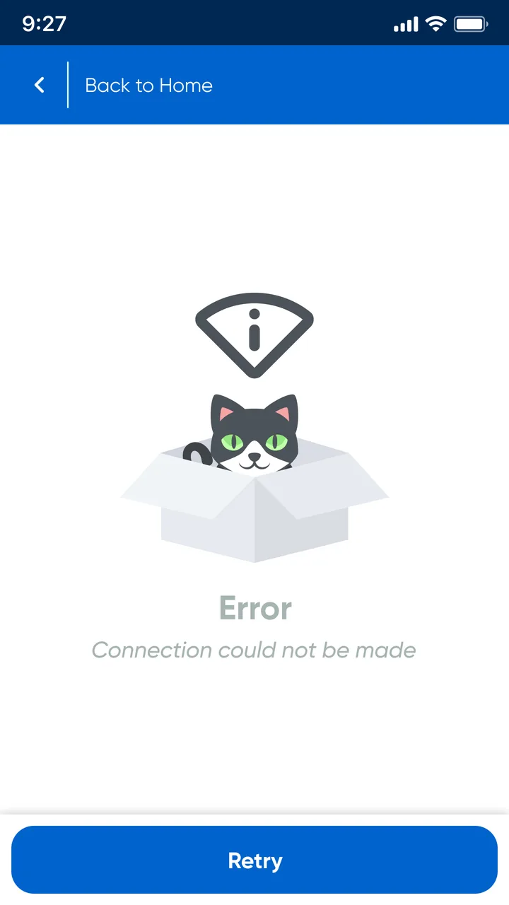
Toll plazas and highways are often patchy for mobile data, so failure states got a design of their own. One template covers every case: the same friendly illustration, a clear message, Back to Home at the top and a full-width Retry at the bottom. Only the icon changes with the cause.
10 — Outcome
A complete product in eight screens
Tag-Mate was submitted for Kotak's UI/UX design intern challenge in 2023. It covers every core FASTag task, from signing in to topping up and buying a new tag, with a brand and style sheet made for it.
- 8screens
- 3core flows from one home
- 3ways to sign in
11 — Looking back
What I would add next
The challenge version covers the core jobs. Taking it further, these are the gaps I would close first.
Low-balance alerts per vehicle
Warn before a trip when a tag is close to the minimum, instead of at the toll gate.
Payment and confirmation steps
Design what happens after Add funds and Make Payment: amount, method, receipt and delivery tracking for a new tag.
Messages that match the cause
The four error states share one line of copy. Each icon deserves its own message and next step.
Accessibility pass
Check contrast on light grey text and placeholders, and make the tab bar icons carry labels for screen readers.