- Mobile UX · Banking
- IBM
- 2025
Mobile banking redesign · IBM
Making a high‑security bank feel welcoming to everyone
A redesign concept for the mobile app of one of India's largest public sector banks. It serves hundreds of millions of customers, from tech-savvy teenagers to seniors using a banking app for the first time.
- My role
- Sole designer, owned the proof-of-concept design end to end
- Team
- 1 lead developer, 6 developers
- Timeline
- 8 weeks, brief to client presentation
- Delivered
- 23 screens and a working Flutter prototype
01
The brief
The bank already had a mobile app. It was secure, but new customers weren't staying. IBM was asked to present a redesign concept that the bank could evaluate before committing to a full build.
Buildable in Flutter
The design had to be practical to build as a single cross-platform Flutter codebase, so the prototype could become the real app.
Modern visual style
The existing app felt dated and inconsistent. The new one needed to look current without losing the trust a bank depends on.
Stand out from competitors
Private banks and fintech apps set users' expectations. The concept had to hold its own next to them.
02
Designing for 500M+ people across the globe
With a customer base this large, there is no “typical user.” The redesign had to work as well for a teenager who lives on fintech apps as for a senior who has never used a banking app.
The goal wasn't to design for the average customer. It was to make everyone feel welcome.
The bank's internal data splits customers into two groups. I worked through it with the team to find where people were dropping off. Insights are summarised here, not the bank's figures.
Existing customers
Retention was not a problem. They were already used to the current app and its many steps.
New customers
Retention was moderately low. Mostly the tech-savvy stayed. Others dropped off at repeated login steps and the OTP and MPIN check required for every change.
03
What the audit of the existing app found
Before designing anything, I audited the existing app and compared it with the apps these customers already use:HDFC BankICICI iMobilePaytmPhonePeJupiter
Each finding became a design direction.
Problem in the existing app
Response in the redesign
Problem
Too many steps to log in
Friction before users even reach their account
Response
A single sign-in screen with a clear path to registration.
Problem
OTP and MPIN for every change
The main cause of drop-off among new customers
Response
A four-level security model where the check matches the risk of the action. See below
Problem
Cluttered home screen
Too much competing for attention
Response
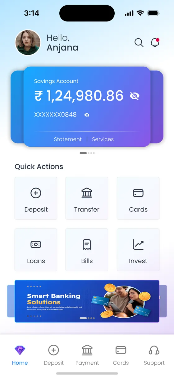
One account card, six quick actions and a single banner. Everything else is one tap away.
Problem
Inconsistent visual style
Screens looked like different products
Response
One visual system, with the same OTP, success and bank-selection screens reused in every flow.
Problem
Hard-to-find features
Users couldn't find common tasks
Response
A five-tab bottom navigation, plus a Payments hub that groups all three ways to send money.
04
Key decision: security that matches the risk
This is one of the most secure banking platforms in the country, and that was never going to change. The problem was that every action needed the same heavy check, so a small update felt as serious as closing an account.
I replaced that with four levels. The more serious the action, the stronger the credential. Routine tasks became effortless, and the strongest checks were kept for actions where they build trust.
BeforeEvery change → OTP → MPIN
Choose a level
Browse: Dashboard, statement list, products and FD variants open instantly. Sensitive numbers stay masked.
App PIN
A quick code for this app only, used with biometrics for low-friction checks such as revealing a balance.
MPIN
A high-security credential that works on both the app and the website and must be changed every 90 days. It's now used only for critical actions.
05
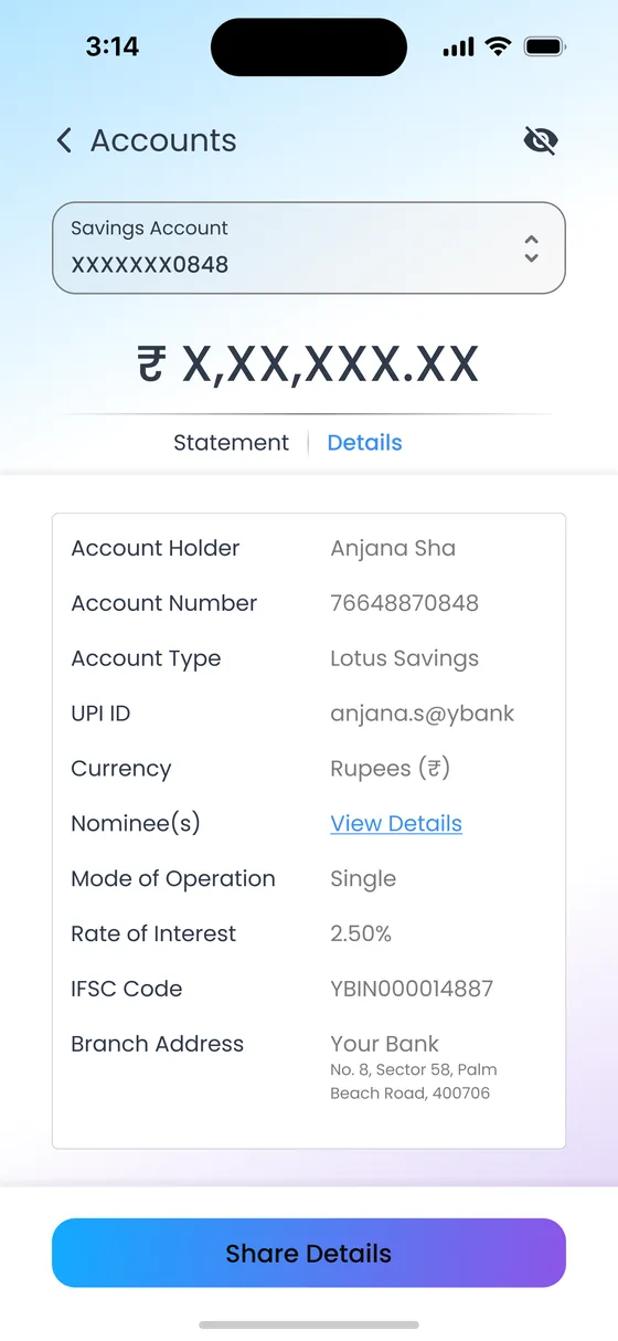
Private by default, one touch to reveal
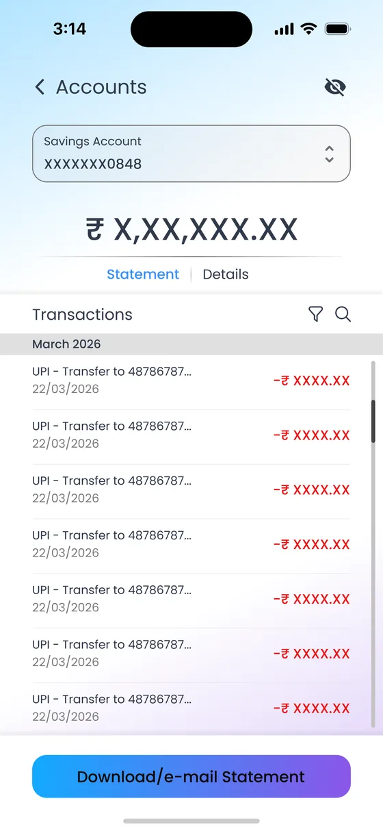
Balances and account numbers are masked when the app opens. People check their bank on crowded trains and in shop queues, so a glance at the screen gives nothing away.
Tapping the eye icon reveals everything after a fingerprint, face scan or app PIN. It adds privacy without adding a step, because people wanted to see their balance anyway.
06
The flows
Twenty-three screens across onboarding, accounts, payments and deposits. Each flow follows the same rhythm: choose, fill in, verify, confirm. Once someone has learned one flow, they know them all.
New customers register with details they already have (account number and IFSC), confirm with an OTP, and land on a clear success screen that invites them to explore.
Step 1Launch 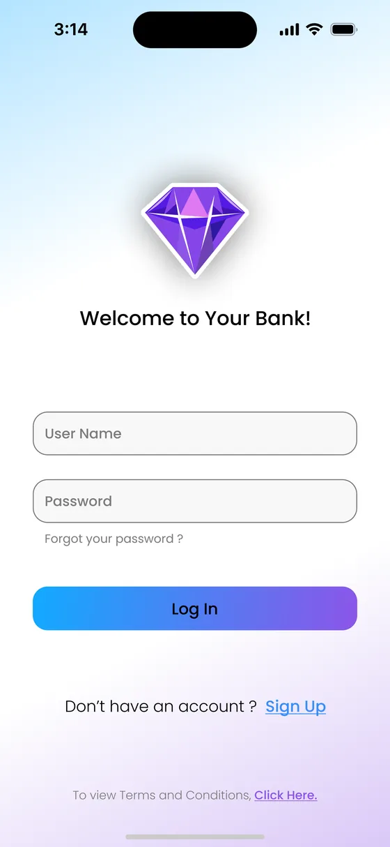
Step 2Sign in, or choose Sign Up 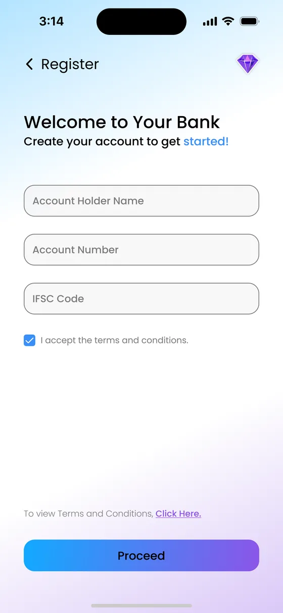
Step 3Enter account details 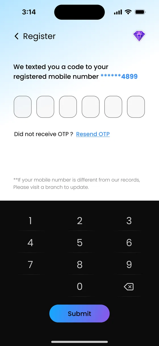
Step 4Verify with OTP 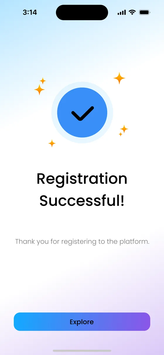
Step 5Registered
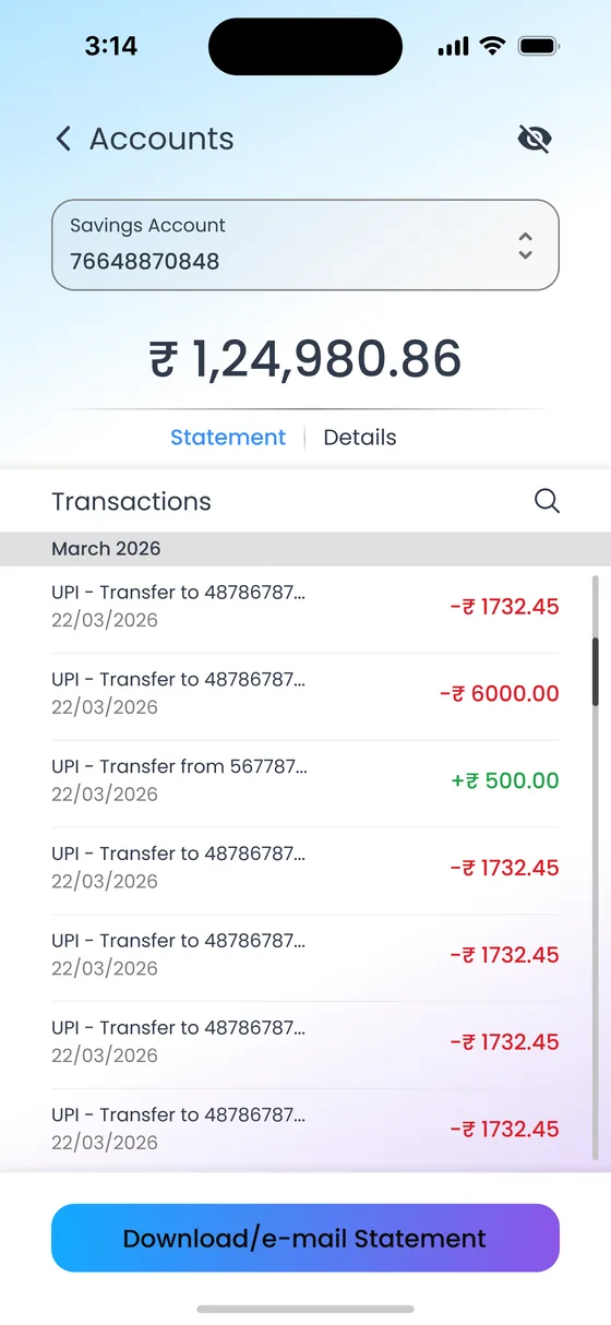
The home screen leads with the account card and six quick actions. Account views split into Statement and Details, both masked until revealed.
Step 1Home Step 2Statement, masked Step 3Statement, revealed 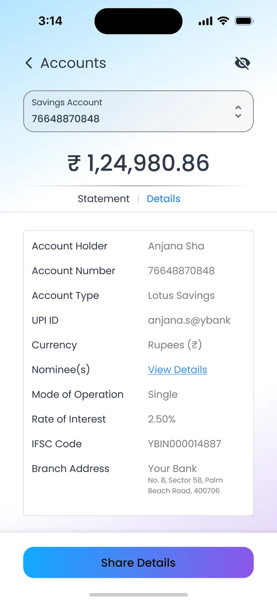
Step 4Account details
For one-off payments to someone not yet saved. Bank selection uses the same grid as Add Beneficiary.
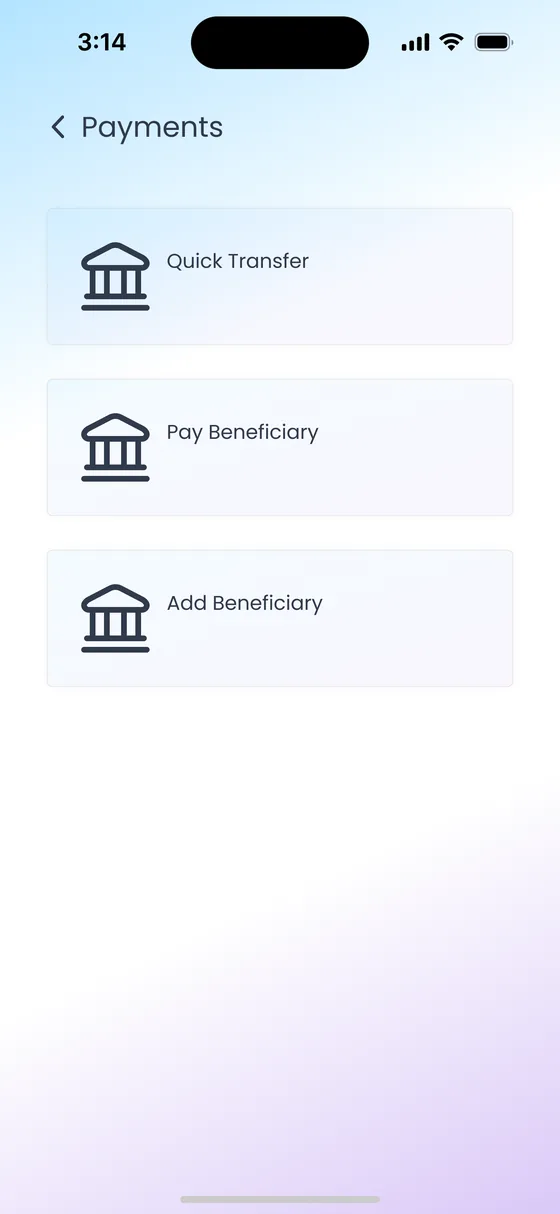
Step 1Payments hub 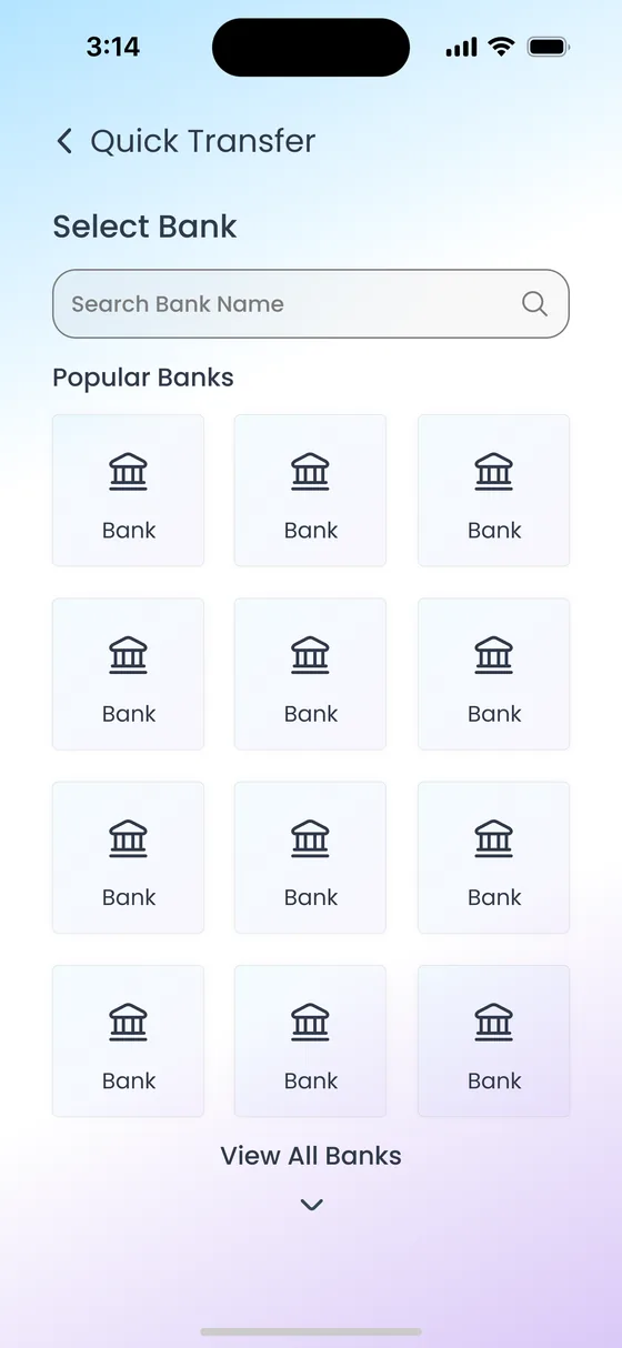
Step 2Choose bank 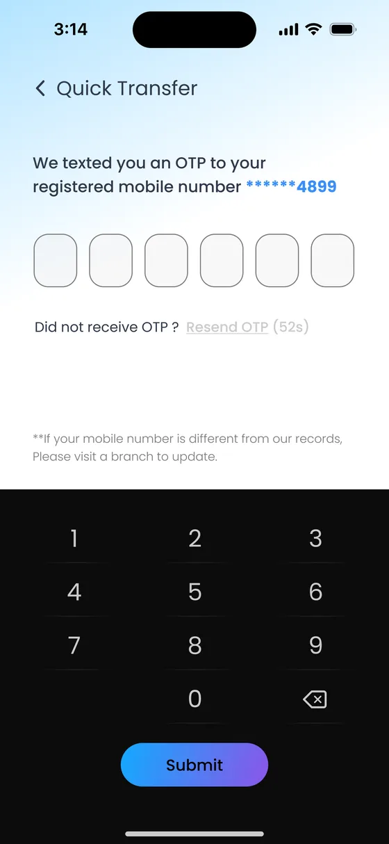
Step 3Verify with OTP 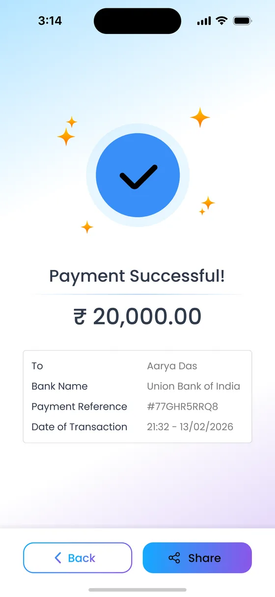
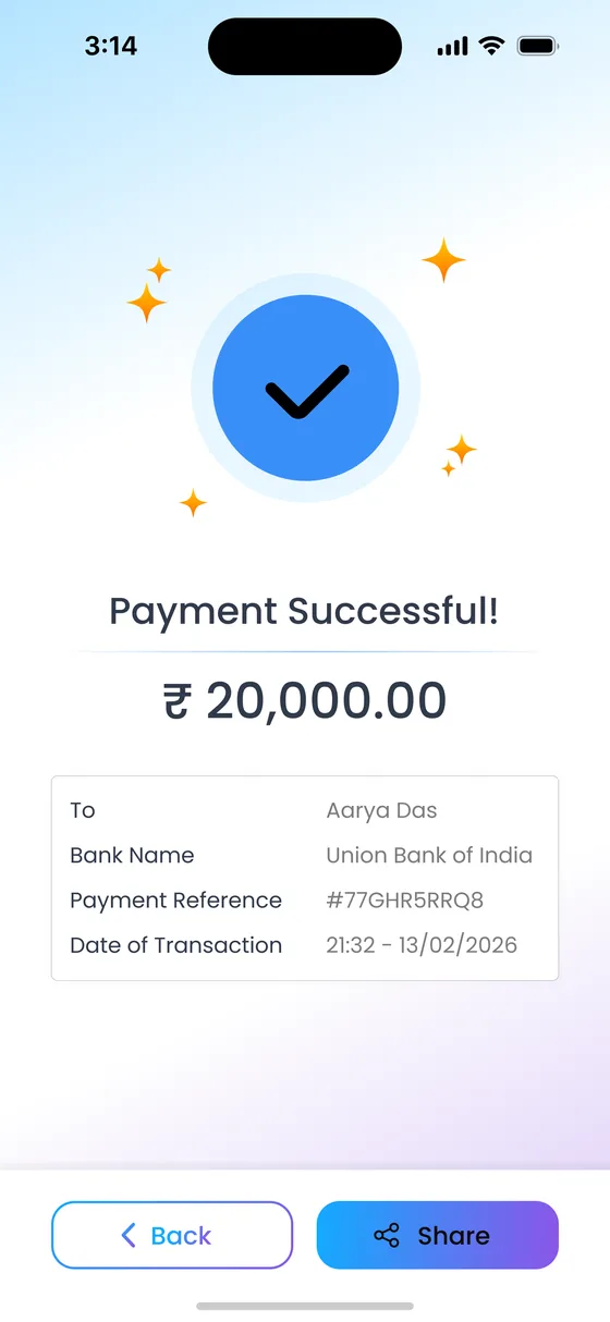
Step 4Payment sent
Saved payees appear as recent transfers. The payee's limit is shown before the amount is entered, so there are no surprises at the end.
Step 1Payments hub 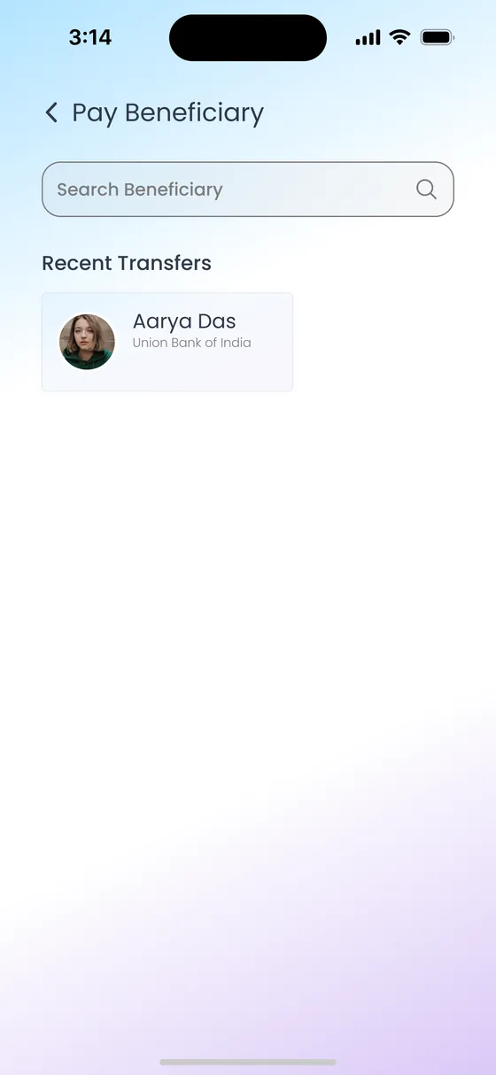
Step 2Pick a payee 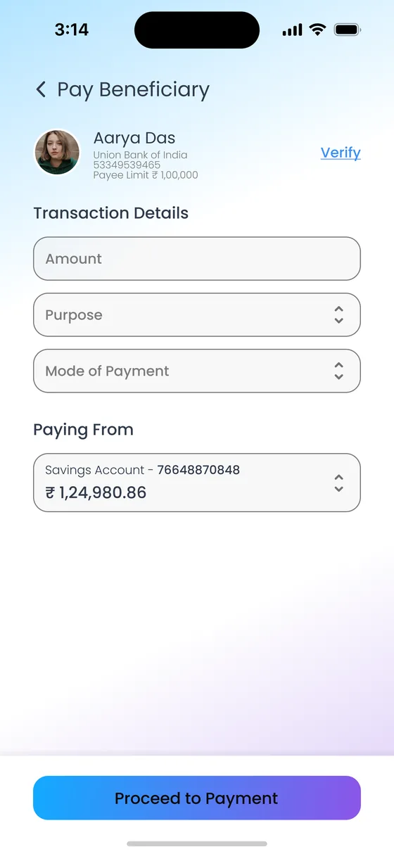
Step 3Amount and account 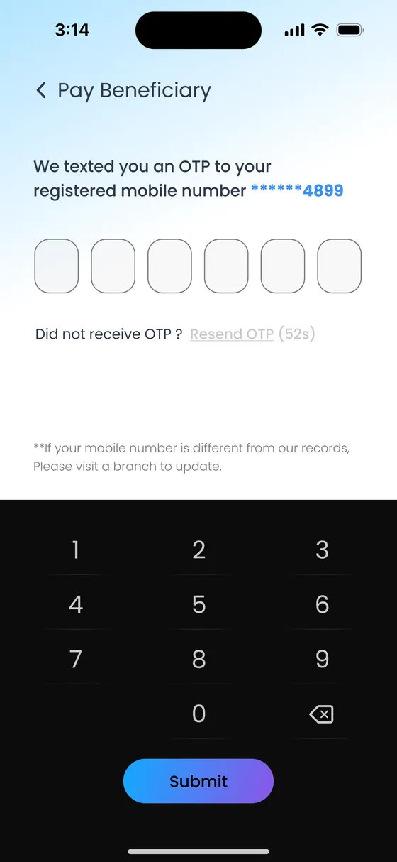
Step 4Verify with OTP Step 5Payment sent
The account number is entered twice and the IFSC can be verified in place. A note explains that money moves by account number and IFSC only, which prevents a common mistake.
Step 1Payments hub 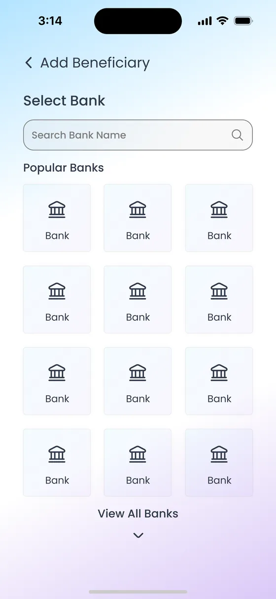
Step 2Choose bank 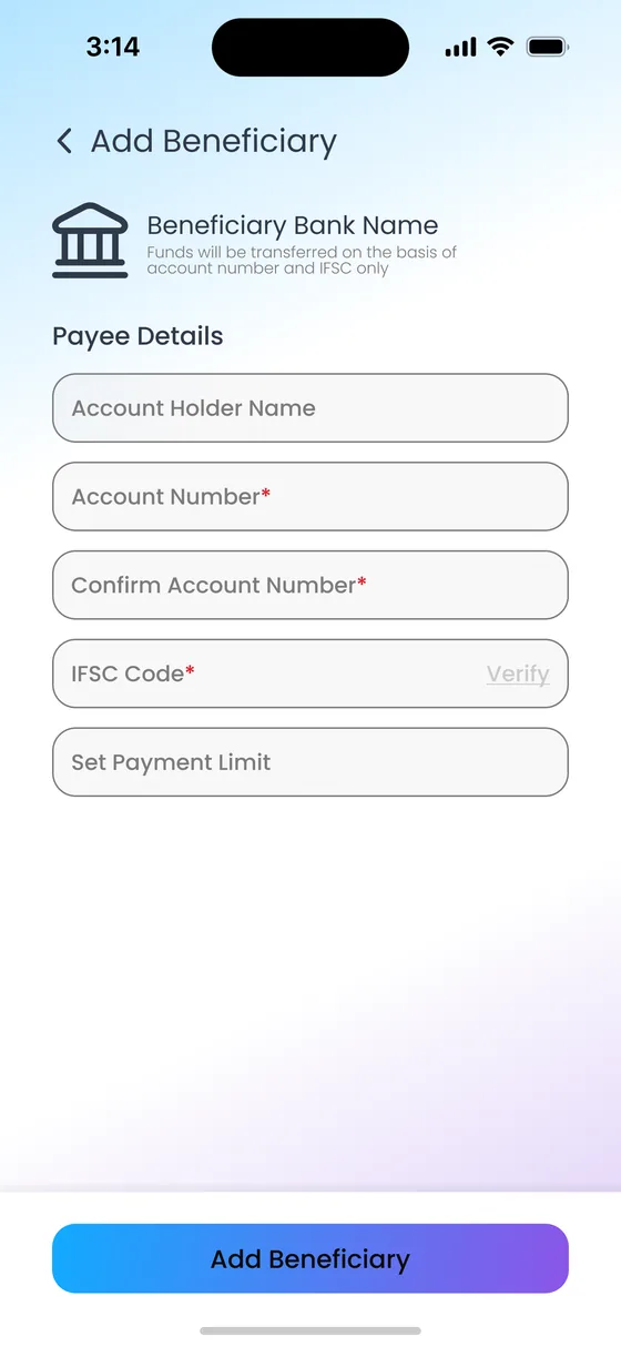
Step 3Payee details and limit 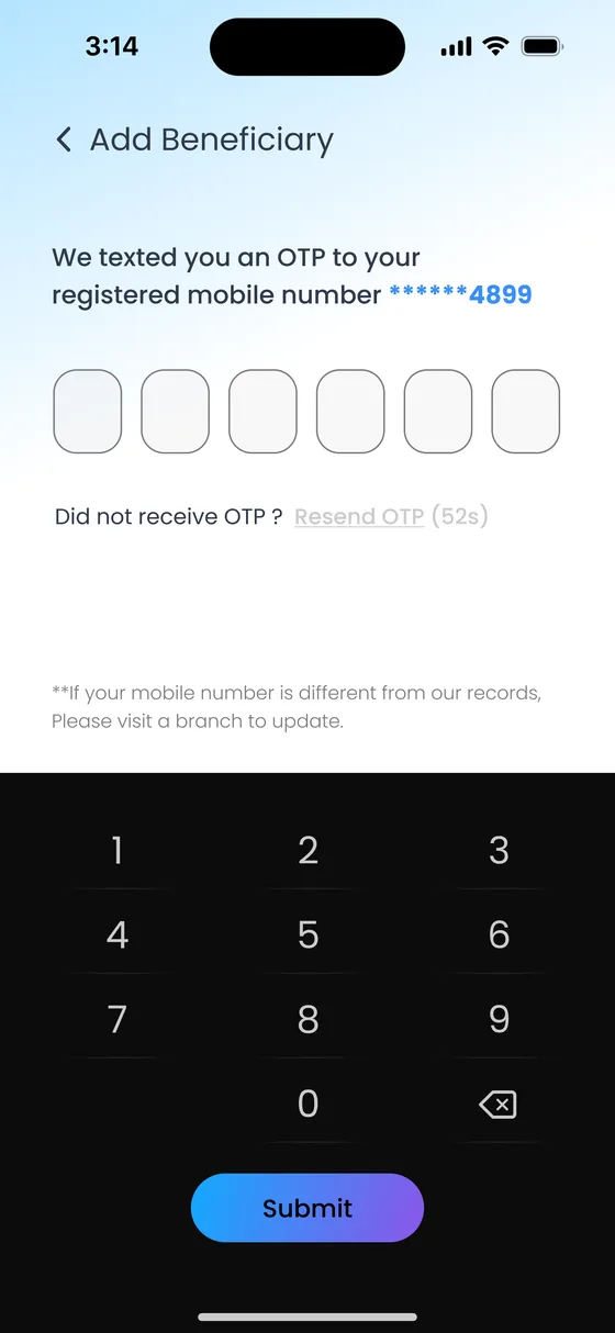
Step 4Verify with OTP 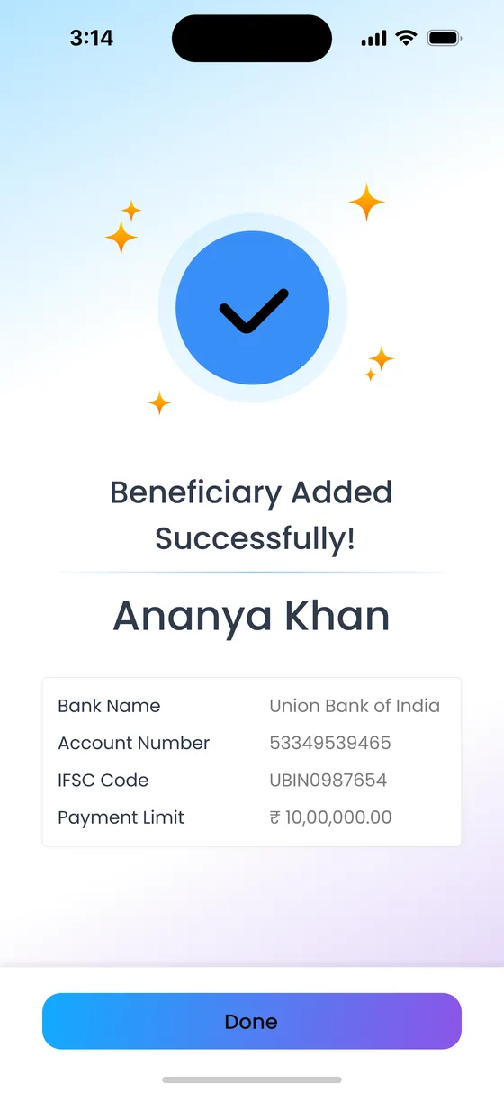
Step 5Payee added
Fixed deposit variants are described in plain language, with 'Know more' expanding the details in place instead of sending people to another page.
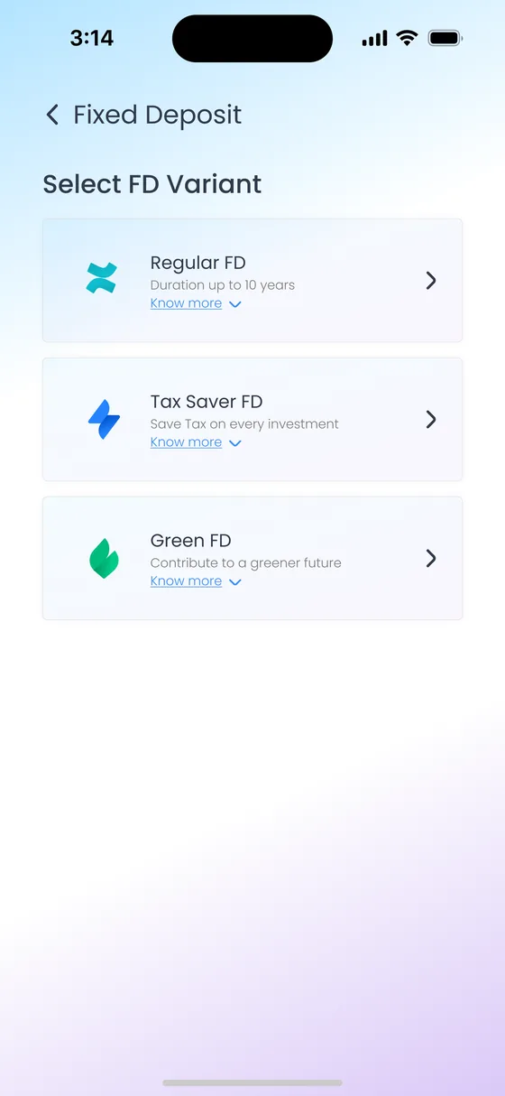
Step 1Choose an FD variant
07
Same screen, every flow
Consistency did two jobs. For users, it means the screen that confirms a payment looks the same everywhere, so it's easy to trust. For the developers, it means one Flutter widget instead of four separate screens.
One OTP screen
Registration, Quick Transfer, Pay Beneficiary, Add Beneficiary
One confirmation screen
Same layout, content changes per flow
08
From wireframes to screens
I sketched the structure in Balsamiq first and settled layout and hierarchy with the developers before adding any visual style. That made it cheap to change direction during the early weeks.
Recreated for this case study; the original project files stayed with IBM
Welcome to Your Bank!
Forgot your password?
No account? Sign Up
Hello, Name
Quick Actions
‹ Pay Beneficiary
Transaction Details
Paying From
09
Designed alongside the developers
I worked with the lead developer and six developers throughout the eight weeks, not just at handoff. I explained my design decisions as I made them, and I weighed the developers' suggestions against the brief before accepting or rejecting them.
Components first
Inputs, buttons, cards, the OTP keypad and the confirmation screen were each designed once and reused. This fits naturally with how Flutter builds interfaces from widgets.
Ideas tested against the goal
When developers suggested a change, the question was whether it helped make the app welcoming, buildable or distinctive. If it didn't, it didn't go in.
A prototype, not a picture
Because the screens were planned with the developers from the start, the PoC became a working Flutter build, not just static mockups.
10
Visual language
The style needed to feel modern next to fintech apps while staying calm enough to trust with money. A soft sky-to-lilac background keeps screens light, and a single gradient is reserved for the main action, so the next step is always obvious.
The app's palette, not this site's
Primary action gradient
#19A5FD → #8758E9, used only on main buttons and the account card
Text
#2F3A4F
Links and status
#3B90F9
Background
#BAE6FF → #DECEF8
Money out
Red amounts
Money in
Green amounts
Celebration
Sparkles on success
Typeface
Poppins
A geometric sans with clear figures, which matters on screens built around amounts and account numbers.
- Balance
- ₹ 1,24,980.86
- Screen title
- Pay Beneficiary
- Body
- Account holder name
Identity

A faceted diamond as the identity, standing for something valuable and well protected.
11
Outcome
The concept was well received in the client presentation, and the bank was considering it. I left IBM before a final decision was made, so I can't speak to where the project stands now.
Friction should be deliberate
Security doesn't have to mean the same check everywhere. Matching the check to the risk of the action reduced friction for routine tasks and kept the strongest protection where it builds trust.
Familiar patterns welcome people
Keeping OTP where users already expect it, and reusing the same screens across flows, is what makes a new app approachable for first-time users.
Developers are design partners
Designing with the build team every week, rather than handing off at the end, is why 8 weeks produced a working Flutter prototype and not just slides.
Client details are anonymised. Screens use placeholder data.